
Effective Wayfinding and Signage Design: The Definitive Guide to Systems That Actually Guide
In complex environments such as hospitals, airports, or university campuses, user disorientation leads to stress, inefficiency, and a negative brand perception. This article presents a comprehensive methodology for addressing the challenge of effective wayfinding and signage design, transforming confusing spaces into intuitive and welcoming environments. Aimed at architects, facility managers, designers, and marketing directors, we explore the complete lifecycle of a wayfinding project: from the initial audit and data-driven strategy to material selection, graphic design, and implementation. Key performance indicators (KPIs) are detailed, such as a 30-40% reduction in search time, an increase in Net Promoter Score (NPS) of more than 15 points, and a measurable ROI through the optimization of people flows and the improvement of operational efficiency. The value proposition lies in a holistic approach that integrates cognitive psychology, user-centered design, and project management to ensure signage systems that not only inform but also guide and enhance the overall experience.
Introduction
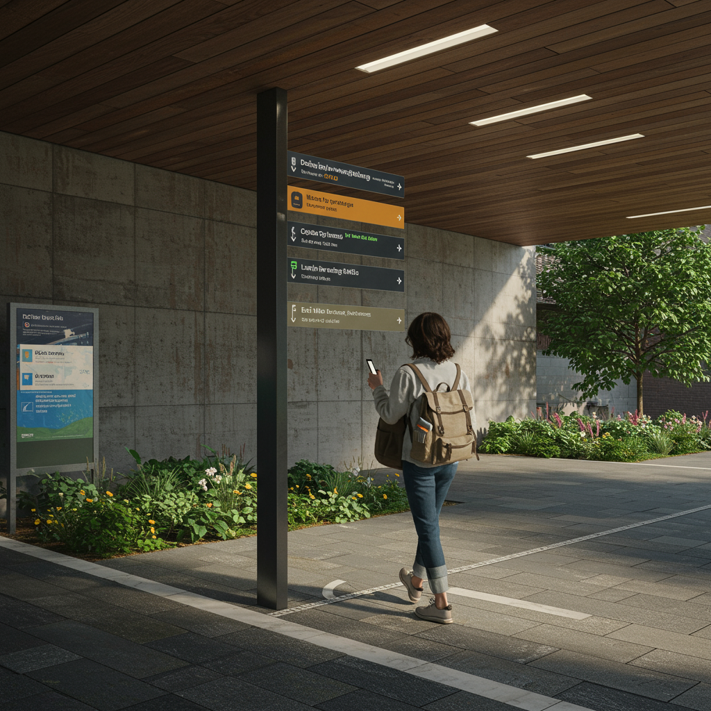
The ability to orient oneself in a space is a fundamental human need. However, as our buildings and cities become more complex, disorientation has become an omnipresent problem. A poor wayfinding system not only frustrates users but also has significant hidden costs: lost productivity, missed medical appointments, poor customer experience, and safety risks. The solution lies in effective wayfinding and signage design, a discipline that combines architecture, graphic design, environmental psychology, and communication strategy. This approach goes beyond simply placing signs; it’s about creating a coherent dialogue between the space and its occupants, anticipating their needs and guiding them smoothly and almost unconsciously from their point of origin to their final destination. A well-executed system reduces cognitive load, fosters autonomy, and reinforces the brand identity of the place.
Our methodology is based on a rigorous and measurable process that begins with an in-depth diagnosis of the environment and user behavior.
We use a combination of flow analysis, interviews, journey mapping, and audits of existing signage to identify pain points. From there, we develop a hierarchical information strategy that defines what message is communicated, where, and how. The success of each project is measured through specific KPIs, such as reducing the average time to find a destination (target: >30%), decreasing the number of requests for staff assistance (target: >50%), and improving visitor satisfaction scores (NPS). This data-driven approach ensures that every element of the wayfinding system directly contributes to operational and customer experience objectives.
Vision, values, and proposition
Focus on results and measurement
Our vision is to transform any complex space into a legible, accessible, and positive environment through intelligent wayfinding systems. We adhere to the 80/20 principle, focusing our efforts on the critical decision points that resolve most user navigation issues. Our core values are user empathy, analytical rigor, and design excellence. We believe that good wayfinding is inclusive by default, meeting and exceeding technical standards such as the Spanish standard UNE 170002 on building accessibility, the ISO 21542 standard for accessibility of the built environment, and the ADA (Americans with Disabilities Act) international guidelines regarding contrast, font size, and tactile signage. Our value proposition focuses on offering measurable solutions that generate a tangible return on investment, whether by improving staff efficiency, increasing visitor spending, or reinforcing security.
- Value 1: User-centered design. We prioritize field research to understand the real needs of diverse user profiles (first-time visitors, staff, people with reduced mobility, etc.).
- Value 2: Data-driven solutions. Every design decision, from sign placement to pictogram selection, is justified with quantitative and qualitative data.
- Value 3: Holistic integration. We consider wayfinding an integral part of architecture, interior design, and brand strategy, not an afterthought.
- Quality criterion: Material decision matrix. We use a matrix that weighs durability (minimum 10-year lifespan), sustainability (recycled content, low VOCs), maintenance cost (€/m²/year), and regulatory compliance to select the optimal materials for each project.
Services, profiles, and performance
Portfolio and professional profiles
We offer a comprehensive portfolio of services covering the entire lifecycle of a wayfinding project. Our multidisciplinary team includes user experience (UX) strategists, architects specializing in traffic flow, graphic designers with expertise in typography and symbology, and project managers with experience in production and installation. Our services are designed to achieve effective wayfinding and signage design, from conception to post-occupancy evaluation.
Operational Process
Phase 1: Diagnosis and Strategy (2-4 weeks). Site audit, plan analysis, user flow mapping, stakeholder interviews. KPI: Identification of 95% of critical decision points.
Phase 2: Conceptual Design (3-5 weeks). Development of zoning logic, information hierarchy, visual vocabulary (typography, color, pictograms), and sign typology. KPI: Concept approval with a client satisfaction score >8/10.
Phase 3: Detailed Design and Documentation (4-6 weeks). Creation of all final artwork, site plans, material specifications, and signage standards manual. KPI: Documentation with 0 critical errors in the production review.
Phase 4: Production and Installation Supervision (variable). Supplier bidding, sample review, installation coordination. KPI: Schedule and budget deviation less than 5%.
Phase 5: Post-Implementation Evaluation (1-2 weeks). User surveys, on-site usability testing, performance KPI analysis. KPI: Achieve the objectives for reducing search time and staff inquiries.
Tables and Examples
| Objective | Indicators | Actions | Expected Result |
|---|---|---|---|
| Improve wayfinding in a hospital | Average wait time for consultation; Number of questions for staff; Patient NPS | Flow analysis, design of a color-coded system by zone, suspended signage at intersections | 25% reduction in search time; 40% reduction in questions; 20-point increase in NPS |
| Increase foot traffic to secondary retail areas | Sales per m² in target area; Visitor dwell time | Creation of visual landmarks, dynamic digital signage, interactive directories | 15% increase in sales in the target area; 10% increase in dwell time |
| Ensure safe evacuation in an office building | Total evacuation time; Compliance with emergency signage regulations | Design of low-profile photoluminescent signage, clear “You are here” maps | 20% reduction in evacuation time; 100% Compliance with the Spanish Building Technical Code (CTE) … We coordinate a network of approved suppliers specializing in different materials and manufacturing techniques, from aluminum milling to glass printing and LED screen integration. The process includes applying for minor works permits if necessary, especially for outdoor signage structures or large-format totems. A detailed execution schedule is developed to minimize disruption to the client’s operations by scheduling noisy or intrusive installations outside of peak hours. Supply chain management is key, ensuring material availability and anticipating alternatives in case of stock shortages to avoid compromising deadlines. |
- Documentation Checklist for Tender: Detailed technical report, manufacturing drawings for each type of sign, material specifications (thickness, finish, RAL), location and assembly plan.
- Contingency Plan: Have at least two qualified suppliers for each critical material. Establish a 5% safety stock for high-turnover items (e.g., vinyl for directories).
- Factory Quality Control: Inspection of prototypes and first production units to verify color accuracy (using a spectrophotometer), finish quality, and dimensional accuracy.
- Installation Protocol: Layout plans, height and positioning guides, personal protective equipment (PPE), and waste management plan for the installation.

Content and/or Media that Convert
Messages, Formats, and Effective Wayfinding and Signage Design
The “content” of a wayfinding system is the information it conveys. It must be concise, clear, and consistent. Success depends on a rigorous information hierarchy. At decision points, messages should be simple and direct (“Emergency Room ←”, “Rooms 1-10 →”). Directories offer more detailed information, and location maps provide general context. We use A/B testing to optimize pictogram comprehension and typography legibility under real-world viewing conditions (distance, angle, lighting). For example, we tested whether a “cafeteria” pictogram is recognized by 95% of users in less than 2 seconds. Conversion in wayfinding is not a sale, but a successful action: the user taking the correct direction without hesitation. Consistency in terminology is fundamental; If a destination is named “Radiology” in a directory, it must be named the same in all subsequent entries.
- Definition of the glossary of destinations (Responsible: UX Strategist): Collaborate with the client to standardize the names of all destinations.
- Design of the pictogram system (Responsible: Graphic Designer): Create or select a consistent and legible set of icons, based on the ISO 7001 standard, and test it with users.
- Typographic selection and legibility testing (Responsible: Graphic Designer): Choose a highly legible sans-serif font (such as Frutiger or Clearview) and conduct reading tests at a distance to define minimum sizes.
- Development of the message matrix (Responsible: UX Strategist): Create A document specifying the exact content of each sign on the location plan.
- Translation and Review (Responsible: Project Manager): Manage translation into other languages if necessary, ensuring review by native speakers.

Training and Employability
Demand-Oriented Catalog
The field of wayfinding requires professionals with hybrid training that is not always found in educational programs traditional. To address this gap, specific training modules can be developed targeting profiles sought after by architecture firms, design consultancies, and large infrastructure managers.
-
- Module 1: Fundamentals of Wayfinding and Environmental Psychology. Principles of spatial orientation, cognitive load, decision-making, and user behavior in built environments.
- Module 2: Strategy and Auditing of Guidance Systems. User research methodologies, route mapping, flow analysis, and signage auditing techniques.
- Module 3: Graphic Design Applied to Signage. Principles of typography, color, iconography, and composition for maximum legibility and accessibility. Applicable Standards (ISO, ADA).
Module 4: Materials, Production, and Project Management for Signage. Knowledge of materials, manufacturing processes, budgeting, planning, and installation supervision.
Module 5: Digital and Interactive Wayfinding. Design of interactive directories, mobile applications for indoor wayfinding (IPS), and content management for digital signage.
Methodology
The training methodology is eminently practical (“learning by doing”). Assessment is carried out using rubrics that evaluate the application of concepts to a real-world case study. Students develop a complete project, from auditing a public building to presenting a detailed design proposal. Internships at partner companies in the sector are encouraged, creating an active job placement service. It is expected that upon completion of the training, 90% of participants will be able to lead a medium-complexity signage project, achieving a measurable 20% improvement in wayfinding KPIs in their projects.
Operational Processes and Quality Standards
From Request to Execution
- Diagnosis (Phase 1): Following the client’s request, an initial site visit is conducted, and the scope is defined. The deliverable is a technical and financial proposal that includes a preliminary work plan. Acceptance criterion: Proposal approved and signed by the client.
- Strategy (Phase 2): Field research is carried out. The deliverable is the “Wayfinding Strategy Document,” which defines the logic, zoning, and hierarchy of the system. Acceptance Criteria: The client validates the strategy document.
- Pre-production / Design (Phase 3): The conceptual and detailed design is developed. Deliverables are the “Concept Design Book” and the “Final Artwork & Location Plan.” Acceptance Criteria: The client approves the final artwork and location plan.
- Execution (Phase 4): Production and installation management. Deliverables are the installed signage elements and the installation closure report. Acceptance Criteria: Satisfactory final inspection (punch list) with the client.
- Closure and Evaluation (Phase 5): The post-occupancy evaluation is conducted, and the maintenance and standards manual is delivered. The deliverable is the “Post-Implementation Report.” Acceptance Criteria: Verification of compliance with the KPIs defined in Phase 1.Quality Control
Roles: The Project Manager is ultimately responsible for quality. The Design Director oversees visual consistency. An external accessibility consultant audits regulatory compliance.
Escalation: Any deviation >5% in budget or schedule is escalated to the steering committee. Production quality issues are handled directly by the Project Manager with the supplier, who has the authority to reject entire batches.
Acceptance Indicators: Color fidelity (Delta E < 2.0), vinyl adhesion (according to cross-sectional test), legibility at the specified distance, 100% compliance with location plans.
Service Level Agreements (SLAs): Response time to customer requests < 24 hours. Post-installation incident resolution in <48 hours.
Mitigation: Triangulation of methods (surveys, observation, interviews).DesignFinal artwork, site plansAccessibility compliance (100%); Brand consistency; 0 errors in text.The design is not to the client’s liking. Mitigation: Intermediate control and approval points (moodboard, initial concept).
| Phase | Deliverables | Control indicators | Risks and mitigation |
|---|---|---|---|
| Strategy | Wayfinding strategy document | Alignment with client objectives (>90%); Identification of all user types. | Incomplete user data. |
| Production | Prototypes, manufactured signs | Color deviation (Delta E < 2.0); Dimensional accuracy (±1 mm). | Supplier delays. Mitigation: Backup providers, penalties for contract delays. |
| Installation | Signage installed | Location accuracy (±5 cm); Area cleanliness; 0 property damage. | Unforeseen site conditions (e.g., unsuitable wall). Mitigation: Prior technical study, team with tools for unforeseen events. |
Application cases and scenarios
Case 1: “Universal Health” Hospital Complex (120,000 m²)
Challenge: The hospital, a mix of old and new buildings, suffered from inconsistent and outdated signage. Patients were missing appointments (8% rate), and reception staff were spending 35% of their time giving directions. The goal was to create a clear, reassuring, and accessible wayfinding system for a diverse and often stressed public, including seniors and wheelchair users.
Solution: A color-coded and letter-based zoning strategy was implemented. “Building A – Blue” housed outpatient clinics, “Building B – Green” inpatient wards, and so on. Each zone had a large identifier at the entrance. A hierarchical system was designed: large suspended signs at main intersections, flag signs in secondary corridors, and identifying signs at each door. The typeface (Frutiger) was chosen for its high legibility. Universal pictograms and text in both Spanish and English were included. Interactive directories with animated routes were installed at the main entrances.
Results:
-
- Reduction in the missed appointment rate due to disorientation to 1.5% (81% improvement).
- Staff time spent giving directions was reduced by 10% (saving 1,200 staff hours per month).
- Patient NPS related to ease of orientation improved from -15 to +40.
- Implementation time: 9 months.
- Cost: €35/m².
ROI recovered in 18 months through improved efficiency and reduced missed appointments.
Case 2: Technological University Campus (15 hectares)
Challenge: An expanding campus with 25 buildings, sports facilities, and residences. New students and visitors were constantly getting lost. Vehicle signage was inadequate, causing congestion. Campus branding was inconsistent across different buildings.
Solution: An exterior and interior wayfinding system was developed. For the exterior, entrance totems with general campus maps, pedestrian directional posts at key intersections, and new, clear road signage were designed. Each building was numbered and logically named. For the interior, a signage standards manual was created that unified the visual style (typography, colors, materials) for all buildings, respecting the identity of each faculty while maintaining overall consistency. A mobile app with an interactive map and GPS navigation was implemented for the exterior, and Bluetooth beacons for the interior.
Results:
The average time for new students to find an unfamiliar classroom was reduced from 12 minutes to 3 minutes.
Peak-hour traffic congestion was reduced by 15% thanks to improved signage for parking and routes.
Student satisfaction with campus signage increased by 60% in annual surveys.
Timeframe: 18 months (phased implementation).
Cost: €1.2 million. The Average Daily Rate (ADR) of summer conferences and events hosted on campus increased by 5% due to the improved visitor experience.
Case Study 3: “Gran Plaza” Shopping Center (85,000 m², two levels)
Challenge: The shopping center had “cold spots” or areas with low foot traffic, resulting in lower sales for the stores in those areas. The static directories were outdated, and customers complained about not being able to easily find the restrooms or elevators.
Solution: The project focused on effective wayfinding and signage design to improve circulation and the shopping experience. Ten interactive digital directories were installed that not only showed the route to a store but also promoted daily offers and events. Visual landmarks (a large sculpture, a digital fountain) were created at key nodes to facilitate mental orientation. A subtle color code was used on the pavement to subconsciously guide visitors to the different wings of the center. The signage for services (restrooms, nursing rooms, ATMs) was made larger and backlit for greater visibility.
Results:
- Pedestrian traffic in “cold spots” increased by 25%.
- Sales in stores in these areas increased by an average of 12%.
- Complaints at the information point regarding the location of services decreased by 70%.
- The average time spent in the center increased by 15 minutes.
- ROI of the project (cost of €450,000) achieved in 24 months.
Step-by-step guides and templates
Guide 1: How to conduct a Wayfinding Audit in 10 steps
-
- Define objectives and user profiles: What do we want to improve? For whom (visitor, employee, delivery person)?
- Gather existing documentation: Architectural plans, brand manuals, staff/service directories.
- Conduct a complete photographic walkthrough: Document every existing sign, its location, and its condition.
- Map key user journeys: Select 5-10 critical routes (e.g., parking → pediatric consultation).
- Conduct shadowing walkthroughs: Accompany real users on their journeys, noting questions, errors, and points of friction.
- Evaluate information hierarchy: Is the information presented at the right time and place? Is there information overload?
- Analyze readability and visibility: Measure color contrast, font size, and check for visual obstructions or poor lighting.
- Verify consistency: Are the same names, icons, and visual style used throughout the system?
- Evaluate accessibility: Is there Braille and tactile signage?
Are the mounting heights correct for wheelchair users?
- Synthesize findings in a report: Create a “pain points” map and a list of prioritized recommendations.
Guide 2: Checklist for Inclusive Signage Design
- Light Contrast: Ensure a Light Contrast Ratio (LRV) of at least 70% between the text/pictogram and its background.
- Typography: Use sans-serif fonts with unambiguous characters (e.g., differentiate I, l, 1). Evitar texto todo en mayúsculas para frases largas.
- Tamaño del texto: Calcular el tamaño mínimo de la letra según la distancia de visualización (regla general: 2,5 cm de altura por cada 3 metros de distancia).
- Pictogramas: Utilizar símbolos internacionalmente reconocidos (norma ISO 7001).
- Altura de montaje: Colocar las señales táctiles (braille, altorrelieve) en un rango de altura de entre 1,20 m y 1,50 m desde el suelo.
- Ubicación predecible: Instalar las señales identificativas de las puertas siempre en el mismo lado (lado del picaporte), no sobre la puerta misma.
- Libre de reflejos: Utilizar materiales y acabados mates para evitar deslumbramientos que dificulten la lectura.
- Lenguaje claro: Usar terminología simple y directa. Evitar la jerga técnica.
- Señalización táctil de pavimento: Incorporar pavimentos podotáctiles para guiar a personas con discapacidad visual en grandes espacios abiertos.
- Opciones multimodales: Complementar la señalización visual con alternativas auditivas (anuncios, balizas sonoras) o interactivas (apps).
Guía 3: Plantilla de decisión de materiales
Use esta tabla para comparar materiales para su proyecto de señalización. Califique cada criterio de 1 (pobre) a 5 (excelente) y pondere según la importancia para su proyecto.
| Material | Durabilidad (exterior/interior) | Coste inicial (€/m²) | Mantenimiento (facilidad/coste) | Sostenibilidad (reciclabilidad) | Resistencia al vandalismo | Estética/Versatilidad | Puntuación total ponderada |
|---|---|---|---|---|---|---|---|
| Aluminio compuesto (ACM) | 4 / 5 | 80-150 | 4 | 3 | 3 | 4 | |
| Acrílico (PMMA) | 2 / 5 | 100-200 | 3 | 2 | 2 | 5 | |
| Acero inoxidable | 5 / 5 | 250-500 | 5 | 5 | 5 | 4 | |
| Laminado de alta presión (HPL) | 5 / 5 | 120-250 | 4 | 3 | 4 | 3 | |
| Vinilo de corte/impreso | 2 / 4 | 30-70 | 2 | 1 | 1 | 5 |
Recursos internos y externos (sin enlaces)
Recursos internos
- Catálogo de tipologías de señales estandarizadas (identificativas, direccionales, de directorio, regulatorias).
- Plantilla de Manual de Estándares de Señalización.
- Checklist de auditoría de wayfinding y accesibilidad.
- Librería de pictogramas vectoriales normalizados.
- Base de datos de proveedores y materiales homologados.
Recursos externos de referencia
- SEGD (Society for Experiential Graphic Design) – Estándares y buenas prácticas.
- ISO 7001: Símbolos gráficos — Símbolos de información al público.
- ISO 21542: Construcción de edificios — Accesibilidad y usabilidad del entorno construido.
- Guías de la ADA (Americans with Disabilities Act) sobre señalización accesible.
- Libro: “The Wayfinding Handbook: Information Design for Public Places” por David Gibson.
- Código Técnico de la Edificación (CTE), Documento Básico SI (Seguridad en caso de Incendio) y SUA (Seguridad de Utilización y Accesibilidad).
Preguntas frecuentes
¿Cuál es el primer paso para iniciar un proyecto de wayfinding?
El primer paso es siempre una auditoría y diagnóstico del estado actual. No se puede diseñar una solución eficaz sin entender a fondo los problemas existentes, los flujos de personas y las necesidades de los distintos tipos de usuarios. Intentar colocar señales sin esta fase de estrategia previa es la receta para el fracaso.
¿Cuánto cuesta un proyecto de señalización y wayfinding?
El coste varía enormemente según la escala, la complejidad del entorno, los materiales elegidos y si se incluye tecnología digital. Como referencia, un proyecto para un edificio de oficinas puede oscilar entre 20 y 50 €/m², mientras que en un entorno complejo como un hospital o aeropuerto puede superar los 100 €/m². Sin embargo, es crucial evaluarlo como una inversión con un ROI medible en eficiencia y experiencia de usuario.
¿Es mejor la señalización digital que la estática?
No es una cuestión de “mejor”, sino de “adecuado para el propósito”. La señalización estática es fiable, económica y perfecta para información permanente (ej. identificador de una sala). La señalización digital es ideal para información cambiante (ej. eventos del día, ofertas, directorios que se actualizan con frecuencia). La solución más potente suele ser un sistema híbrido que combine lo mejor de ambos mundos.
¿Cómo se mide el éxito de un nuevo sistema de wayfinding?
El éxito se mide comparando los KPIs antes y después de la implementación. Las métricas clave incluyen: reducción del tiempo para encontrar destinos, disminución del número de personas que piden indicaciones, aumento en las puntuaciones de satisfacción (NPS), mejora del flujo de personas a zonas objetivo y, en entornos comerciales, el impacto en las ventas o el tiempo de permanencia.
¿Qué importancia tiene la accesibilidad en el diseño de señalización?
Es fundamental. Un sistema de wayfinding que no es accesible para todos, no es un sistema efectivo. El diseño inclusivo no solo es una obligación legal y ética, sino que además beneficia a todos los usuarios. Por ejemplo, un alto contraste de color ayuda a personas con baja visión, pero también a cualquiera que lea la señal desde lejos o en condiciones de poca luz.
Conclusión y llamada a la acción
Un diseño de señalización y wayfinding efectivo es mucho más que una cuestión estética; es una herramienta estratégica que impacta directamente en la funcionalidad de un espacio, la experiencia de sus usuarios y los resultados del negocio. Como hemos visto, a través de un proceso metódico que abarca desde la investigación inicial hasta la evaluación post-implementación, es posible transformar entornos confusos en lugares intuitivos y eficientes. Los KPIs demuestran que la inversión en un sistema de guiado bien planificado genera retornos tangibles, ya sea reduciendo costes operativos, incrementando ingresos o mejorando la seguridad y la satisfacción. La clave del éxito radica en un enfoque centrado en el ser humano, respaldado por datos y ejecutado con un rigor técnico impecable. No subestime el poder de una buena orientación; es la base para una experiencia de usuario positiva y memorable. Si su organización se enfrenta a los desafíos de un espacio complejo, el momento de actuar es ahora. Realice una auditoría profesional de su sistema actual y dé el primer paso hacia un entorno más claro, accesible y eficiente para todos.
Glosario
- Wayfinding
- Proceso cognitivo y conjunto de herramientas que las personas utilizan para orientarse y navegar de un lugar a otro. Incluye señalización, pero también arquitectura, puntos de referencia y mapas mentales.
- Señalética
- Disciplina que estudia y desarrolla los sistemas de comunicación visual (señales) para guiar a los usuarios en un espacio. Es la aplicación práctica del wayfinding.
- Punto de decisión
- Lugar en un recorrido donde un usuario debe tomar una decisión sobre qué camino seguir, como una intersección de pasillos o un vestíbulo.
- Jerarquía de la información
- Organización de los mensajes de orientación en niveles de importancia, presentando solo la información necesaria en cada punto para evitar la sobrecarga cognitiva.
- Landmark (Punto de referencia)
- Elemento arquitectónico o artístico distintivo y memorable que ayuda a los usuarios a crear un mapa mental del espacio y a orientarse.
- Accesibilidad
- Cualidad de un entorno que permite a todas las personas, incluidas aquellas con discapacidades, utilizarlo de forma autónoma y segura. En señalización, incluye braille, altorrelieve, contraste, etc.
Internal links
- Click here👉 https://uk.esinev.education/masters/
- Click here👉 https://uk.esinev.education/diplomates/
External links
- Princeton University: https://www.princeton.edu
- Massachusetts Institute of Technology (MIT): https://www.mit.edu
- Harvard University: https://www.harvard.edu
- Stanford University: https://www.stanford.edu
- University of Pennsylvania: https://www.upenn.edu